Reading Candlestick Charts: A Beginner’s Guide
Candlestick charts pack four prices into one shape. Learn to read the body, the wicks, and what a single candle is really telling you.
Key takeaways
- Every candle has a body and usually two wicks (also called shadows).
- A long body shows strong, one-sided movement.
- A single candle rarely means much on its own.
Candlestick charts are the default view on most trading platforms because they show a lot of information in a compact form. Each candle summarises a single period — an hour, a day, a week — using four prices.
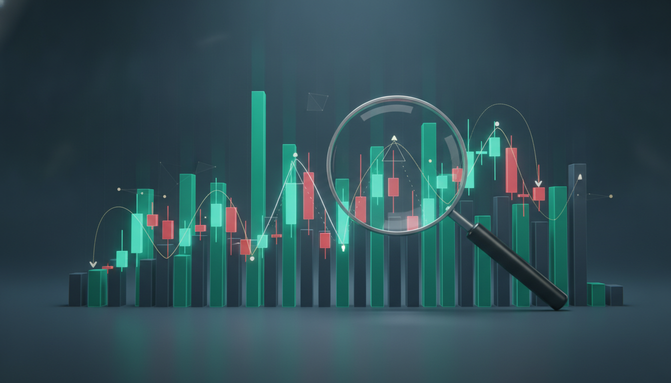
Anatomy of a candle
Every candle has a body and usually two wicks (also called shadows). The body spans the open and close of the period. The wicks reach up to the high and down to the low. A candle is typically coloured green when price closed higher than it opened, and red when it closed lower.
What the shape suggests
A long body shows strong, one-sided movement. A small body with long wicks signals indecision — price travelled far but came back. A long lower wick means buyers pushed price back up after a dip; a long upper wick means sellers capped a rally. None of these are guarantees, only clues about the balance of buyers and sellers.
Use them in context
A single candle rarely means much on its own. Traders read candles in sequence and alongside trend, volume and support or resistance levels. Start by recognising the basic anatomy, then study how clusters of candles behave around key price areas.
A journalist with several years of experience in news and entertainment reporting, now writing a variety of articles on crypto, finance and markets. Based in New York.